Introduction
I have used Steinberg Cubase since the days of the Atari 1040 ST when it loaded from a double-density floppy disk and did nothing but MIDI. I’ve stuck with it – perhaps more through habit than anything else – and suffice is to say I’m invested in Cubase. Music has always been important to me so I’ve upgraded Cubase year after year. I did so again recently, upgrading from Cubase 12 to Cubase 13. That’s the reason for this post.
Now, I’m very careful about having “who moved my cheese” responses to changes in UI design when any software is upgraded, but this time I think there’s more going on that warrants closer investigation and comment. If you haven’t figured out already my response to the Cubase 13 user interface (UI) changes is pretty negative. Not entirely for subjective reasons; although they do play a part. No, Cubase 13 has introduced some genuine usability issues that make it pretty much unusable for me and have left me quite bamboozled. In fact, I’m still using Cubase 12 as a result.
A few things about me to provide context. Most importantly my eyes are nowhere as good as they used to be. To be clear, I’m not visually impaired as such but age-related degeneration is taking its toll. For example, using laptops, tablets and smart phones are now all a challenge. I also suffer from migraine headaches (with aura) so have to be careful about what screens I use as well as all the other lifestyle issues that accompany migraines.
I’d also like to say that I’ve been in software development for over 25 years and I am currently a Director of Software engineering for a global enterprise. I get it. Software is hard. I see that some people – such as some people on the Steinberg support forum – are taking any criticism of the Cubase 13 UI as “having a go” at the developers. That’s not the case. Actually, I would expect such decisions to be handled by the Product team, probably in conjunction with UX or design specialists. The developers’ job is to implement those designs. I would not be surprised to find out that the developers saw this coming.
I include a section about potential issues when moving a UI from a skeuomorphic paradigm to flat design towards the end of this post, if the specifics of the issues I’ve faced do not interest you.
So, on to the criticism.
Usability issues – Project Window
For me, the Cubase 13 user interface is much harder to use. So much so in fact it is causing me issues – such as eye strain – due to a number of factors including inappropriate text sizes across the UI and contrast issues.
Let’s look at some examples, starting with the Project Window.
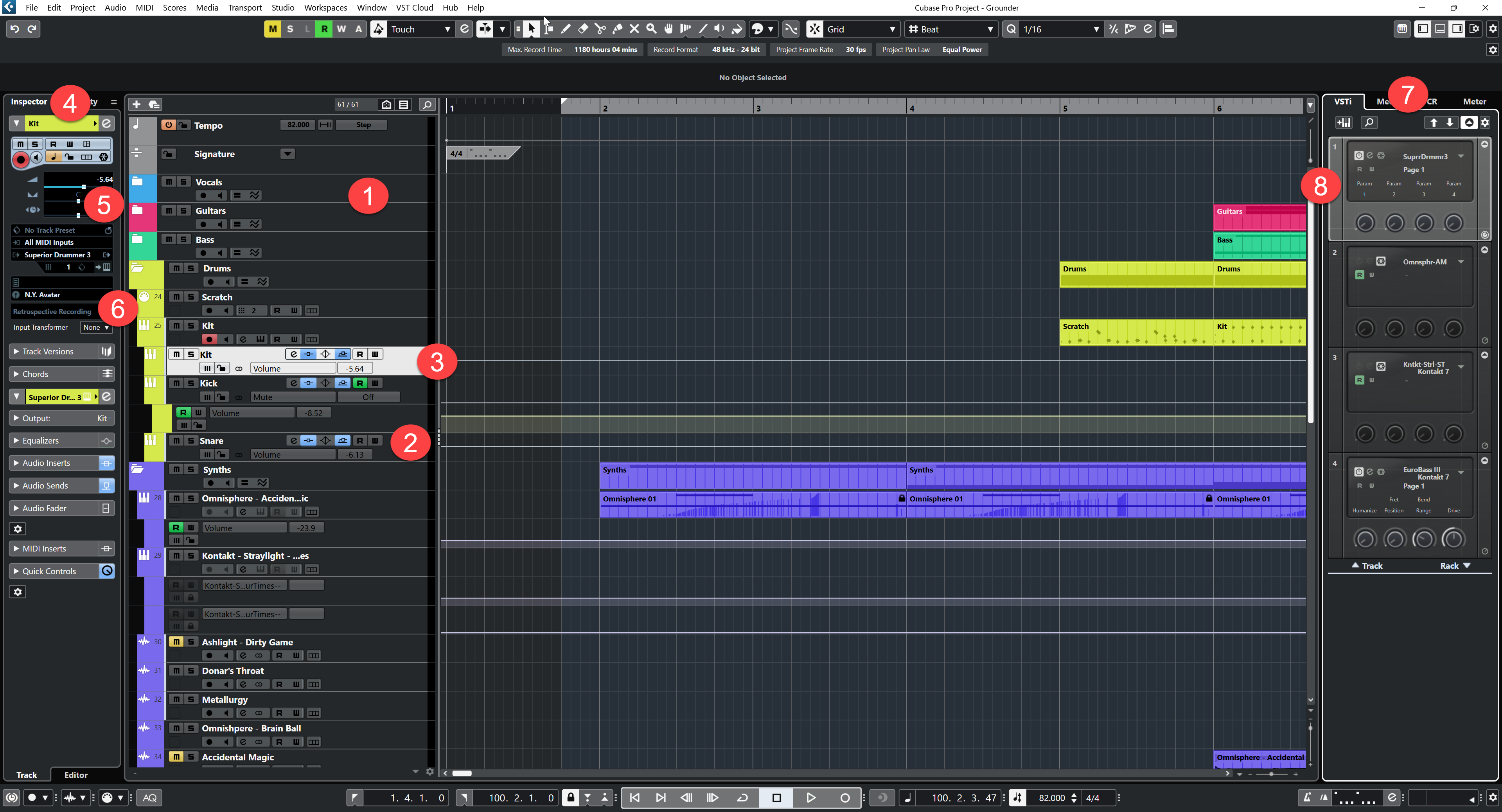
Figure 1 – the Cubase 12 Project Window
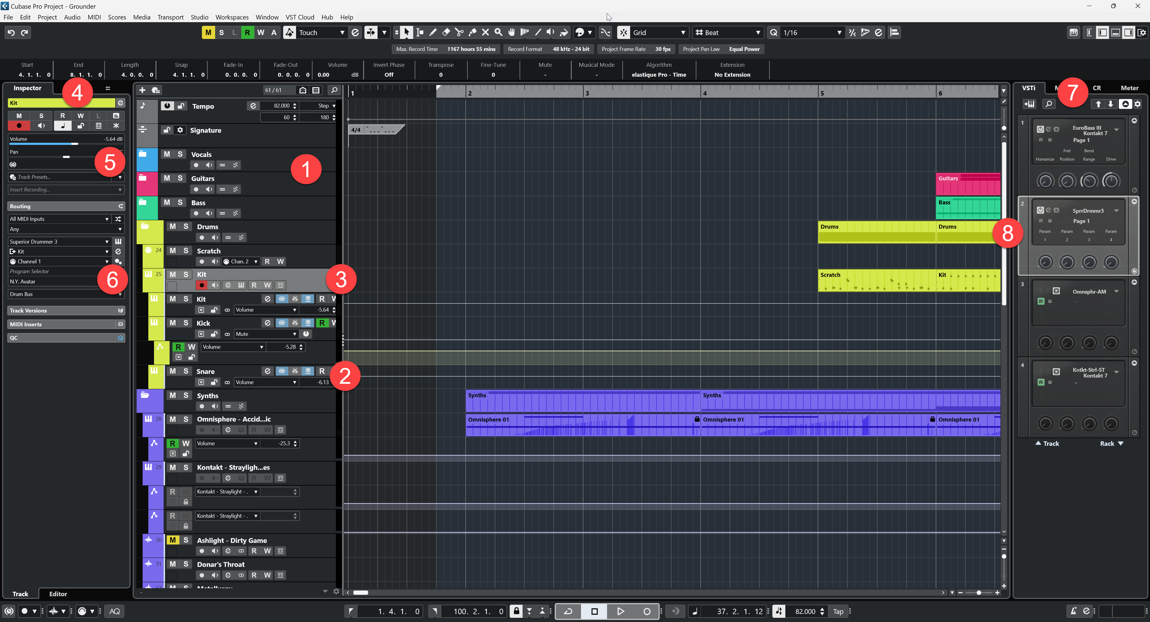
Figure 2 – The Cubase 13 Project Window
The following items refer to numbered positions in the screenshots (figures 1 and 2) above.
Project Window – Item 1
- In Cubase 13 separation between the tracks is much less obvious with black lines used instead of light grey. This makes it much less obvious where the splits occur.
- The Mute and Solo buttons in Cubase 13 have the same boldness and font colour as the corresponding track name creating an overall lack of delineation between functional areas.
- In Cubase 13, use of the light colour and bold font for inactive items means they dominate more than they should, making active items less obvious.
Project Window – Item 2
- In Cubase 13 contrast on the state buttons is low making them difficult to decern. The icons on the active items are effectively illegible to me being white on light blue.
- Again, in Cubase 13 the use of a light colour font for inactive state buttons makes them dominate more than they should. Delineation between active and inactive buttons is therefore much lower than it should be.
Project Window – Item 3
- Active track is much less obvious in Cubase 13 due to reduction in contrast. More effort required for me to locate the active track.
Project Window – Item 4
- In Cubase 13 the various sections of the Inspector are much less obvious. I have to focus hard on the Inspector to see any sections.
- The section containing the mute, solo, freeze etc buttons at the top is so much easier to see in Cubase 12. Even the use of colour for active items (orange) makes them stand out considerably more than in Cubase 13. I cannot overemphasise how much harder it is to see and process this section in Cubase 13.
Project Window – Item 5
- I can barely read the slider values in Cubase 13. Too small, too thin and poor contrast. The value “-5.64 db” is all but illegible. It’s not great in Cubase 12, but it is much better than in Cubase 13.
Project Window – Item 6
- Again, in Cubase 13 the use of low contrast and small thin font makes this area pretty much unreadable in Cubase 13. Use of bolder white text on black in Cubase 12 is a dramatic improvement and is much easier for me to read.
Project Window – Item 7
- OK, so this is less about unsalability and more about aesthetics, but why is the VSTi section on the right unchanged and un-flattened in Cubase 13? The whole Project Window feels incoherent as a result. The rework feels half done. Actually, I want it left as it is to be honest.
Project Window – Item 8
- Why has the Superior Drummer virtual instrument been moved from slot 1 (as it is in Cubase 12) to slot 2 in Cubase 13? My project template always has Superior Drummer in slot 1. This is happening in all my projects but, even worse, in other projects it moves to different slot numbers. I now have to hunt for Superior Drummer rather than knowing automatically it will be in slot 1.
General comments on the Project Window
The Cubase 13 Project Window is visually incoherent. The left zone has tiny text and poor contrast. The track list has huge, bright overbearing text and overall blocky appearance. The VSTi section has the same look it had before with an appearance somewhere in the middle of the other two. These 3 sections don’t look or feel like they belong together.
Why is this important? You can’t find a screen resolution that makes the whole thing work effectively as a whole.
Visually recognising important information and active items is much harder in Cubase 13 than it was in Cubase 12. This all adds up to increased effort to find what you are looking for. Some information is actually illegible to me now in Cubase 13.
Usability issues – the mixer
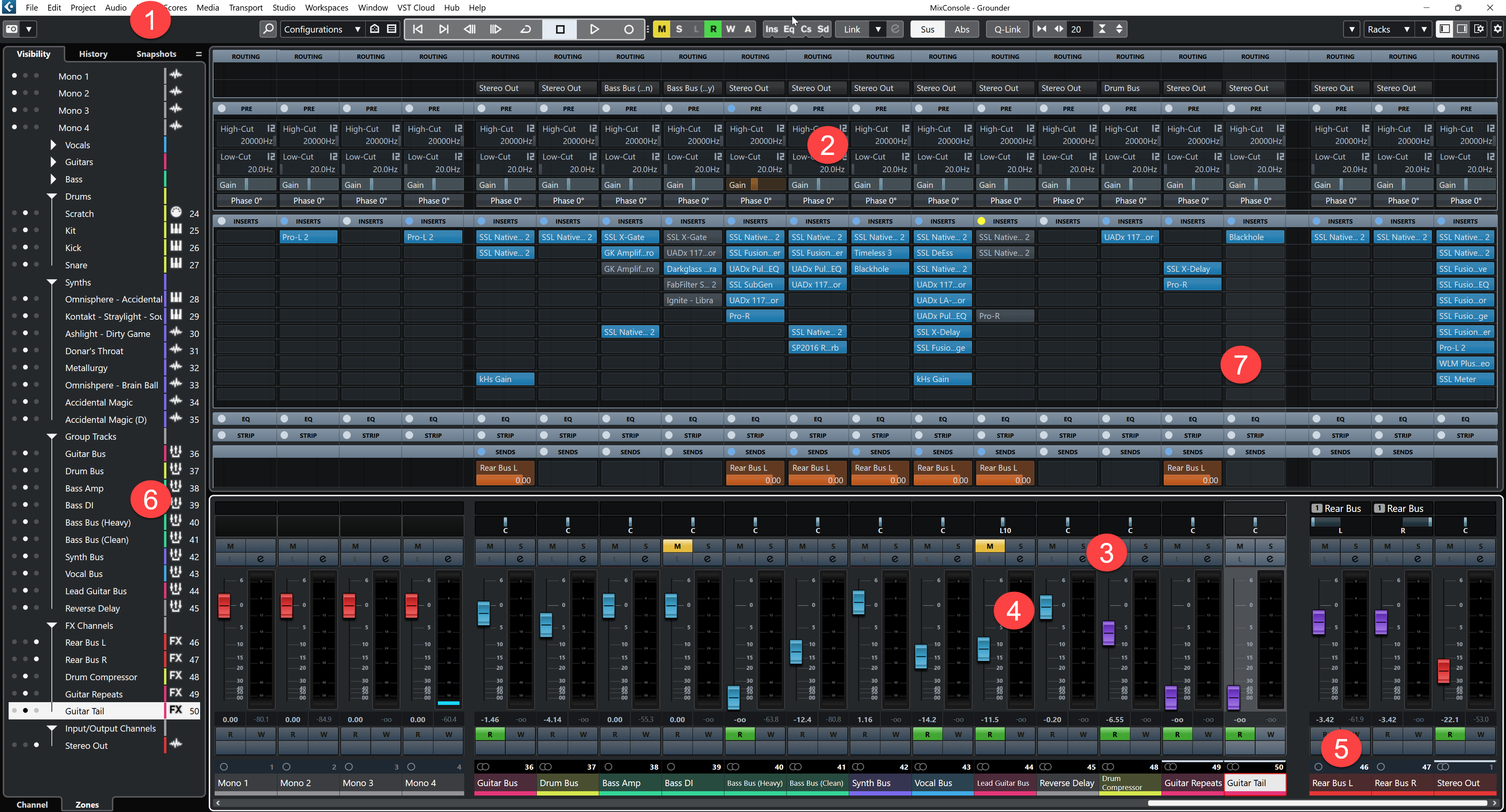
Figure 3 – Cubase 12 mixer
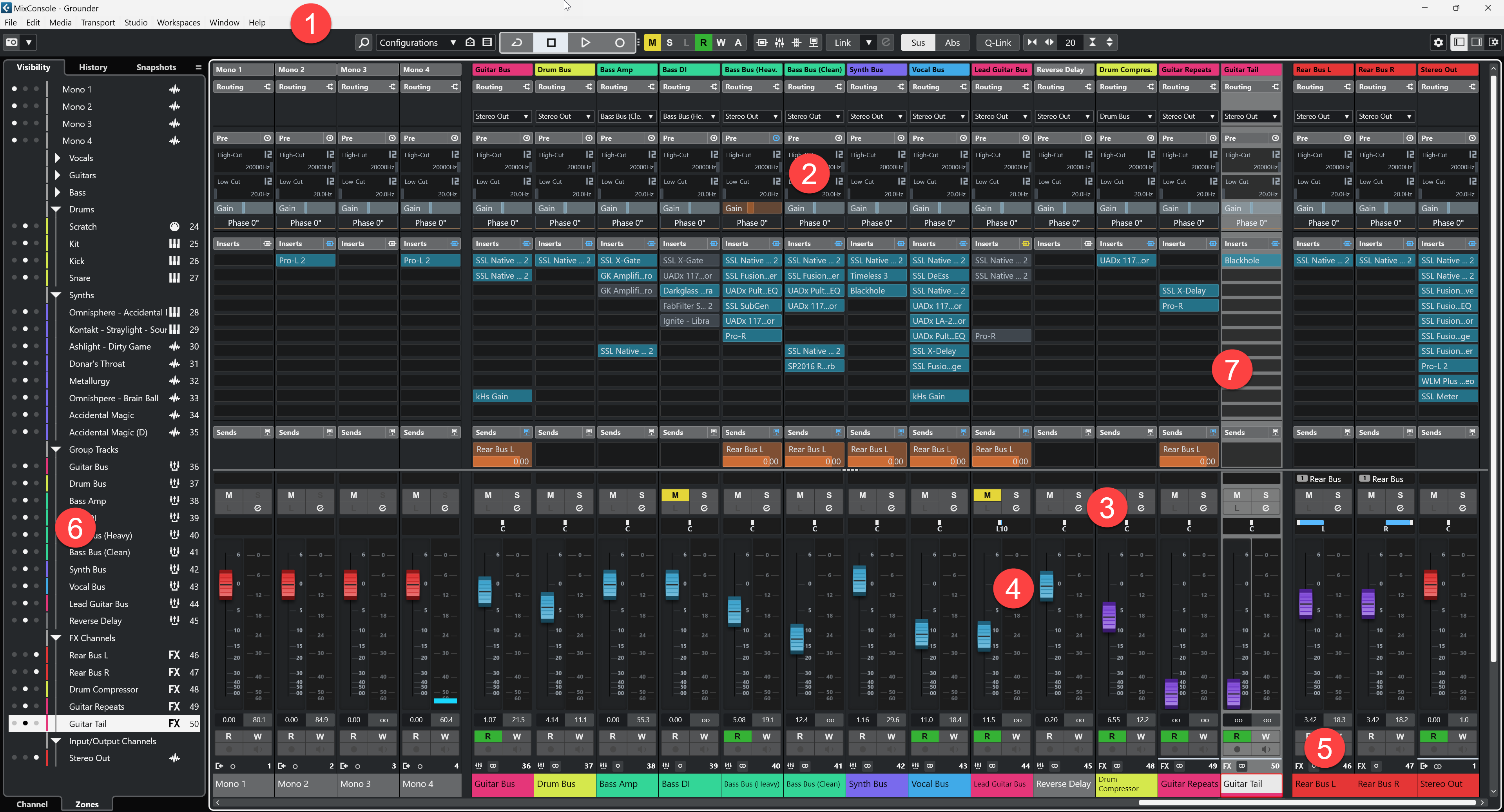
Figure 4 – Cubase 13 mixer
Mixer – Item 1
- The window border (menu bar) in Cubase 13 has stollen some screen real-estate when compared to Cubase 12. This is important in a window where space is of such a premium. Something else has to be hidden or made smaller as a result.
Mixer – Item 2
- In Cubase 13 the values are much harder to read. Contrast with the background is reduced and text is smaller. This was already difficult; in Cubase 13 it’s impossible for me.
- Take note of the gain sliders. In Cubase 12 they are obviously part of the PRE section and cannot be confused with the horizontal dividers like PRE, EQ or INSERTS . In Cubase 13 the gain sliders and horizontal dividers are very similar. This leads to visual confusion.
Mixer – Item 3
- In common with the Project Window, in Cubase 13 white bold text for inactive items makes them dominate. Differentiation with active selections is harder.
Mixer – Item 4
- Not a usability issue I grant but why the almost skeuomorphic fader in Cubase 13? Are we blocks or not blocks? Don’t get me wrong, I much prefer the aesthetic of Cubase 12 anyway, but that’s subjective I know.
Mixer – Item 5
- This item is surprisingly important for me! If you really want to trigger a migraine, Cubase 13 has the solution. The use of thin black text on harsh coloured backgrounds causes me to experience visual strobing. This is actually accompanied by physical discomfort. The Cubase 12 experience – with a muted coloured background – is so much more restful and legible.
- I can barely read the channel labels in Cubase 13 due to the issues mentioned above.
Mixer – Item 6
- Again, not a usability issue but really, why move the coloured bars? Looks suspiciously like change for change sake to justify an upgrade.
Mixer – Item 7
- I feel it necessary to call out that better visibility of the active channel in Cubase 13 is actually not a bad thing. That’s something Cubase 12 could have done with improving.
General comments on the mixer
For me, the mixer in Cubase 13 has become flatter and different sections are harder to make out. Contrast is reduced overall. Text is smaller and harder to read. In common with the Project Window, white text on buttons makes them dominate so it’s harder to decern active from inactive items.
Overall, the Cubase 13 mixer is just a flat field of anonymous boxes. Of particular note is the fact that in Cubase 13 the horizontal sections (e.g. Inserts, Sends etc) are very difficult to pick out. In Cubase 12 they literally jump out at you. In Cubase 13 I have to study the screen to identify these sections, something I didn’t have to do in Cubase 12.
The visual strobing I experience with the coloured channel labels in Cubase 13 is enough to block my adoption of this product on its own.
The Cubase 13 mixer makes my eyes work a lot harder, and for me that’s bad. For me the onset of eye strain and migraine headaches are directly and negatively affected by exactly these kinds of issues.
The challenge of moving away from skeuomorphic interfaces
In addition to the genuine usability issues I have experienced and described above, I’ll admit I’ve also had a negative subjective reaction to Cubase 13. I much prefer the look and feel of Cubase 12. There is something polished about it in comparison to Cubase 13, which now looks cheap. Flat. Boring.
I would also like to point out that I don’t understand the move away from any amount of skeuomorphism. It reminds me of when Microsoft released the Windows phone along with a completely flat user interface based on their Metro design language. Actually, I think Metro was really good (I am one of the few who had a Windows phone at that time!) but I suspect that’s because it was a design language implemented on the phone from scratch, not an adaptation of an existing UI. In response, Apple threw a wobbly and immediately started flattening their iPhone interface too, not necessarily for the better because they ended up with a not quite flat, not quite skeuomorphic interface.
Metro was adopted by Windows 8 but its philosophy has since all but been abandoned on the desktop. Windows 11, for example, makes extensive use of shaded elements and subtly rounded corners. It has a much softer look all round. The success of a flat design on a phone doesn’t necessarily translate to the desktop.
Moving a skeuomorphic interface to flat design has challenges, some of which are definitely relevant here. For example:
- Loss of Affordance Clues: Skeuomorphic designs often provide strong visual cues about how an object should be used (like a button appearing pressable). Flat design, with its minimalistic approach, can sometimes make it less clear how users are supposed to interact with elements, potentially leading to usability issues.
- Over-Simplification: In the pursuit of minimalism, important design elements might be oversimplified, leading to a loss of functionality or clarity. Essential features and navigational cues might become less obvious.
- Accessibility Concerns: Flat design can sometimes compromise accessibility, particularly if contrast and clear separations between elements are not adequately maintained. This can affect users with visual impairments.
- User Adaptation: Users accustomed to skeuomorphic design might find flat design less intuitive initially. This can especially affect less tech-savvy users or those who resist change in familiar interfaces.
- Consistency: Ensuring that the new flat design is consistently implemented can be challenging, especially if an incremental approach is being adopted.
- Technical and Resource Constraints: Redesigning a user interface involves time, effort, and resources. There may be technical challenges, especially if the existing infrastructure was closely tied to the skeuomorphic design principles.
- Aesthetic and Branding Challenges: Skeuomorphic designs often have a distinctive look and feel that may be closely tied to a brand’s identity. Switching to flat design requires careful consideration to maintain brand recognition and aesthetic appeal.
Each of these challenges requires careful consideration to ensure that the transition to flat design improves or at least maintains the usability, accessibility, and aesthetic appeal of the user interface.
Why is this of any importance? Well, for one thing I can’t figure out why Steinberg are making Cubase flat in the first place because nearly all the plugins I use are full-on skeuomorphic. The contrast has become really jarring. Take a look.
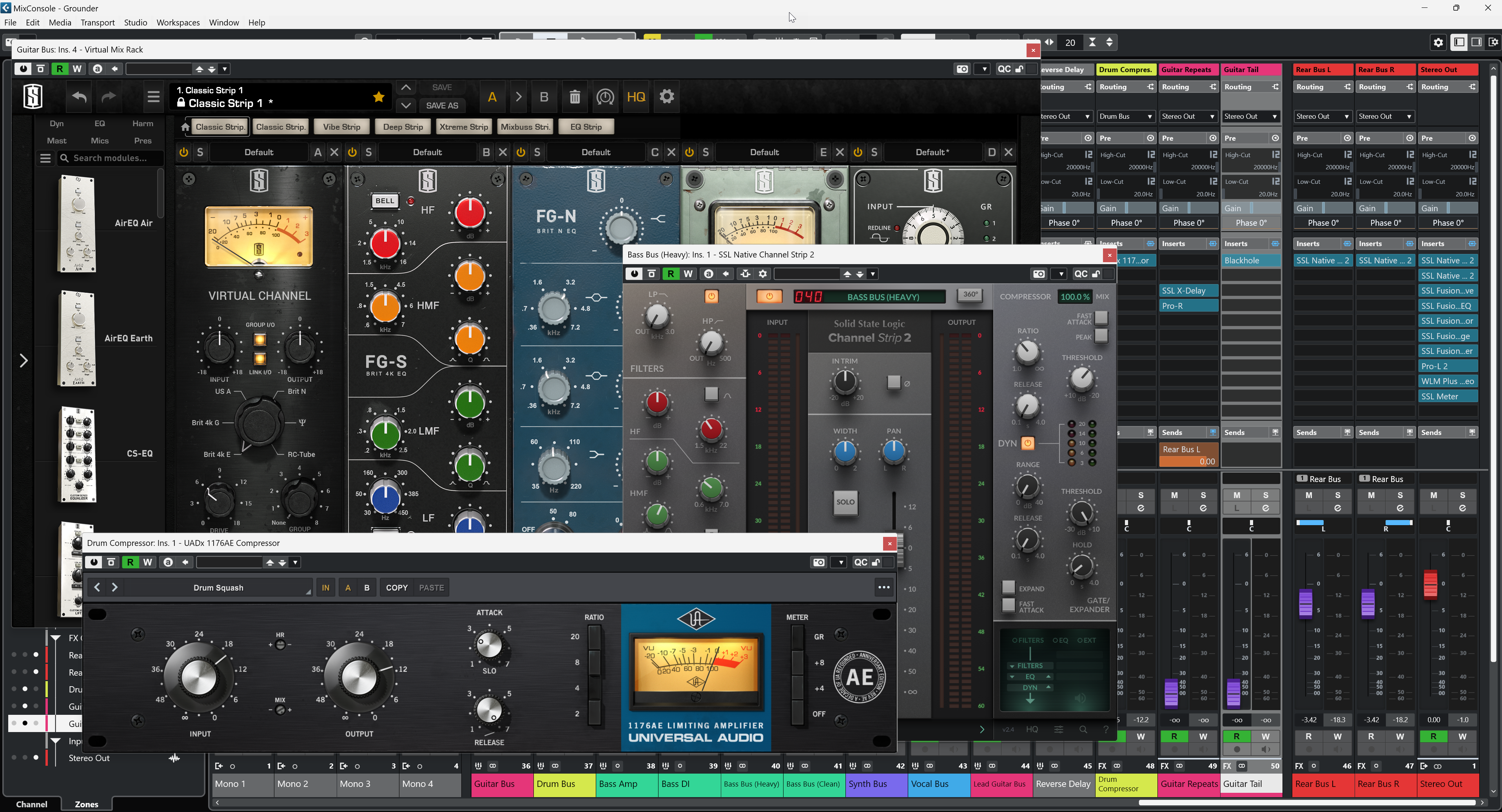
Figure 5 – Skeuomorphic plugins in the Cubase 13 mixer
Above are examples from Slate Digital, SSL and UA. All highly skeuomorphic. Almost every high-end plugin I have – at least those that seek to emulate hardware – is like this. Now these have to sit in the context of a super flat Cubase mixer. Seems odd that Steinberg would go this way to me. Other DAWs are flat I guess but then again I don’t use them. Yet.
Conclusion
Negative subjective reactions aside, the usability issues with Cubase 13 make it unviable for me at the moment. Challenges with failing eyesight and the constant spectre of migraine headaches means this new user interface is simply unusable for me.
I have the distinct impression that this is a forced UI change to make Cubase 13 look different to induce customers to upgrade rather than it being an attempt at genuine improvement. If it has been an attempt at the latter I don’t think it’s been a success. Quite the opposite in fact.
Flat design is fine when implemented from the ground up so the UI functions within the constraints of the design language from the outset. Changing legacy UIs is a harder proposition because the UI controls typically don’t fit the flat design paradigm. I am afraid Cubase 13 has fallen in to this trap.
I have returned to Cubase 12 for the time being and will probably try to get a refund on Cubase 13, unless Steinberg can provide some sort of reassurance that the interface will be corrected. It’s a shame, I’ve used Cubase since 1990 and don’t want to change but – if this new design sticks – what else can I do?
By the way, there is an extensive discussion of this topic on the Steinberg support forum too.
I agree with your assessment as a whole in regards to the design upgrade on Cubase 13. Even the pan sliders have really gotten smaller to see while mixing my tracks. Another thing I noticed are the the MIDI tracks which really bugs the heck out of me. It don’t seem to align properly with the other tracks as far as having the same size when adding more tracks. I have to constantly resize each track to get them aligned with the other tracks manually. I’m not getting any younger either and my eyes are not as active and alert… Read more »
Thanks for taking the time to comment. I’ve been trying to set my reservations aside and have been using Cubase 13 consistently for a while. I have to say nothing has changed for me. It’s a downgrade from the previous version and remains difficult to use. The Inspector in the Project Window is particularly bad for me – so much time wasted trying to find what I’m looking for there. There was a rumour of a patch release with improvements but I haven’t seen any sign of it and there was a warning that it wouldn’t undo all of the… Read more »